Wednesday 24 March 2010

Final Posters


These are our final three posters. They are the same as our last posters but the slogan is more spaced out and more even. We tried to get each of the words exactly the same size but as we got the words from 'www.dafont.com' we had to get each word seperatly. Therefore the words are not perfect but they are the best we could do.


Wednesday 10 February 2010

Posters


These were originally going to be the final posters. We then decided that the slogan was not spaced out enough and did not look very professional. Therefore we changed the spacing of the slogan.


Friday 5 February 2010

Typography

These are the different typography that we found for all three of our posters.


We chose this typography because it looks like fridge magnets which young children always play with and it is clear. Therefore this is the typography we decided to use.

We chose this typography because it looks like a child's writing, we have decided not to use it as the 'o's are too big.

We choose this typography because it looked like someone has drawn it. We have decided not to use it because it looks too old.

It looks like a little child has wrote it, and scribbled back over, emphasising the words. But once you change the colour of the words, it does not give the same effect.

Poster Three Shots

These are the final shots for the third poster.


We are not using this image because she is smiling.

We are not using this shot because we do not like the angle.

We are not using this shot because she is smiling.

We are not using this shot because we decided it was the wrong angle.

We are not using this shot because the phone is too far away from her.

This is the final shot we are using on the third poster because the phone is not too far away from her and she looks frightened.

Poster Two Shots

These are the final shots we took for the second poster.
This shot is not being used as he looks to far away from the computer screen.
We are not using this image as he does not look very scared.

We are not using this shot because he has not got his hand on the mouse.

This is the final shot we are using as his hand is on the mouse, he is not too far away from the screen and he looks frightened.


Poster One Shots

These are the shots for the final images which will be used in our first poster.


We are not using this image because she looks too happy.
We are not using this one because she does not look sad or frightened enough.

We are not using this image because she looks like she is smiling.


This shot is not being used as again she looks like she is smiling and someone is sitting in the background.


We are not using this shot because someone is in the background.


We are not using this one because she does not look scared.


This is the image we are using, because she looks scared and there is nobody in the background.

Friday 29 January 2010

Practice Shots

Here are some of our practice shots we did so we know when we use the children how we want to shoot them.


This shot has the back of the computer on it, and Lilys face. This might not be a great shot to use as the audience can not see what is on the screen. This shot is without the fist coming out of the screen as that would be edited in at a later time. This shot would be better without the people in the background and if it looked like a home rather than in school.


This shot is from the back of Lily and focusing more on the computer screen. I do not think this is as good as the last one as we cannot see Lilys face and you cannot really see what is on the screen.


This shot is good because the computer screen and Lilys face can both be seen. It could be improved if the background was different. Also, if there was something on the screen instead of just a blank screen.


This shot is of the computer screen, the phone, the piece of paper and Lily huddling up, scared. We thought it would be better if Lilys face was showing and if there was something on the screen.


This shot is of Lily scared on the table, with the piece of paper and the computer and phone in the background. Again, we think it would be better if Lilys face was showing and if the computer screen had something on it.


This shot is of Lily as the main picture. She is looking scared and is under a table, which is something alot of children do when they are frightened. The computer is in the background and the paper is by her side. The computer would be better if there was something on it and you could only see one computer instead of two.


Wednesday 27 January 2010

Thumbnails

The following images are the thumbnails that me and Lily drew for possible poster designs.


This is one of our poster designs. It is of a child who has drawn a list of the things that he or she is scared of. At the bottom, 'computer' is in bold to highlight that that is the thing they are most scared of. At the top, their is a fact about cyber bullying to shock the audience.


This poster shows a young girl using the computer. The computer has a fist coming out towards the girl, representing that words hurt children as much as physical bullying does. We have chosen this poster as one of the three posters to use.


This poster is showing a young girl holding a bit of paper which she has wrote everything she is scared of. At the bottom of the paper, the word 'computer' is highlighted to stand out and this is the thing they are most scared of. The girl is looking upset so the audience know how much of a draumatic time it can be. This is one of the three of our final poster designs.

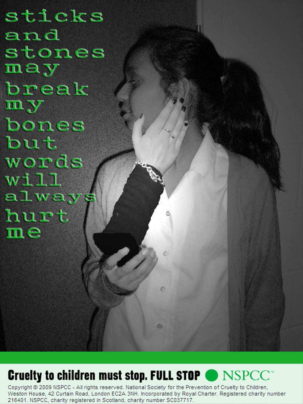
This poster is of a girl holding her phone with a hand coming out slapping her. Again, this is showing that being cyber bullied is just as bad as being physically abused. We will not be using this poster as one of our final designs as the hand coming out might not look real enough as it would be too big to come out of the phone.

This is a poster of a girl at a computer screen with a foot coming out kicking her. This is to show that words hurt just as much as kicking does. We are not using this poster as it is too similar to our first poster with the punch coming out of the screen.

This poster is going to be our final design. It will be of a child hunched up in the corner as the main picture in the poster. The paper, and the computer screen will be in the background. This is to show the affect cyber bullying has on children. We noticed that in all of our designs, all the children are girls, so to overcome this problem, some of our final posters will be including boys.