Wednesday, 24 March 2010

Final Posters


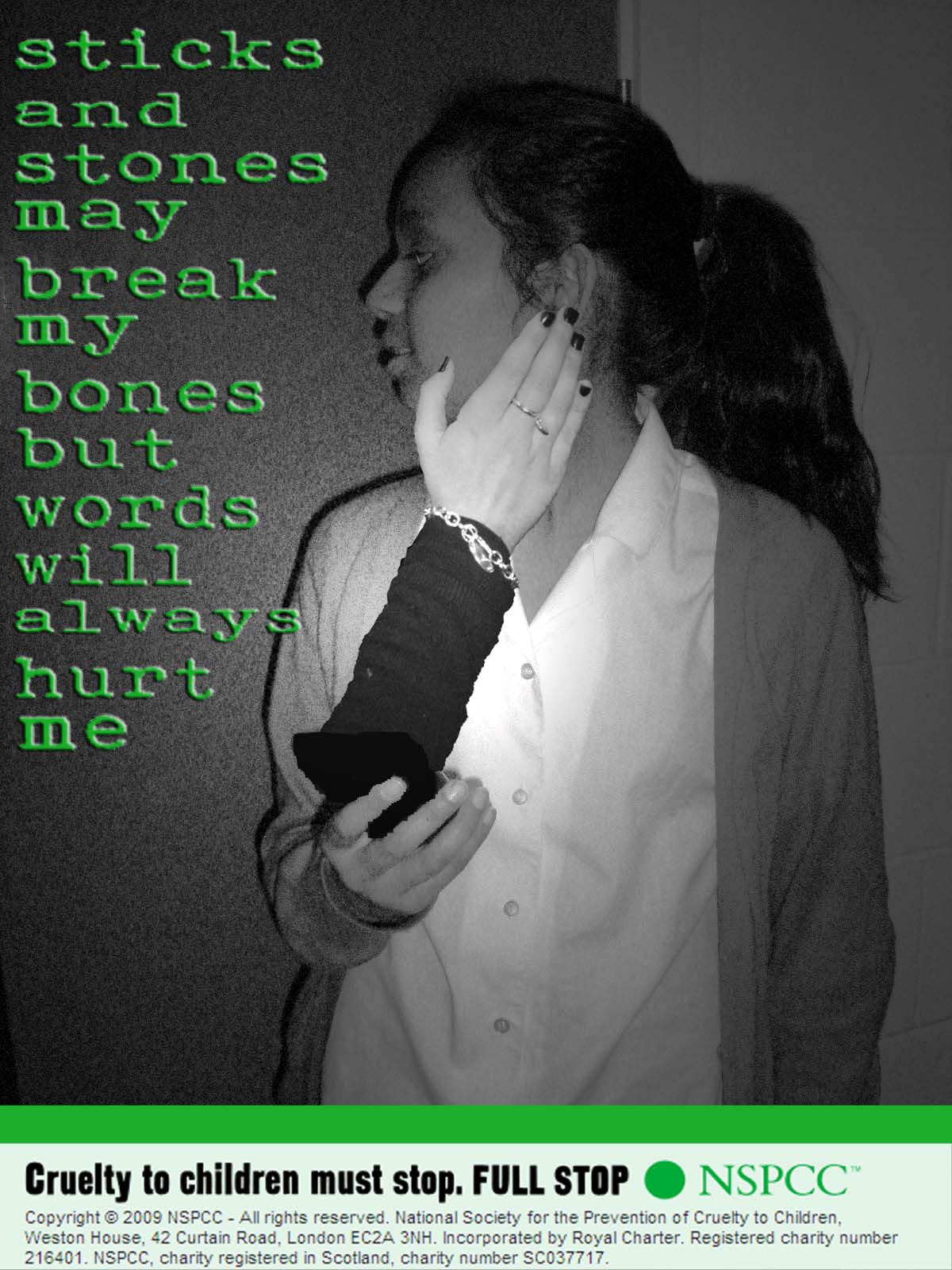
These are our final three posters. They are the same as our last posters but the slogan is more spaced out and more even. We tried to get each of the words exactly the same size but as we got the words from 'www.dafont.com' we had to get each word seperatly. Therefore the words are not perfect but they are the best we could do.


Wednesday, 10 February 2010

Posters


These were originally going to be the final posters. We then decided that the slogan was not spaced out enough and did not look very professional. Therefore we changed the spacing of the slogan.


Friday, 5 February 2010

Typography

These are the different typography that we found for all three of our posters.


We chose this typography because it looks like fridge magnets which young children always play with and it is clear. Therefore this is the typography we decided to use.

We chose this typography because it looks like a child's writing, we have decided not to use it as the 'o's are too big.

We choose this typography because it looked like someone has drawn it. We have decided not to use it because it looks too old.

It looks like a little child has wrote it, and scribbled back over, emphasising the words. But once you change the colour of the words, it does not give the same effect.

Poster Three Shots

These are the final shots for the third poster.


We are not using this image because she is smiling.

We are not using this shot because we do not like the angle.

We are not using this shot because she is smiling.

We are not using this shot because we decided it was the wrong angle.

We are not using this shot because the phone is too far away from her.

This is the final shot we are using on the third poster because the phone is not too far away from her and she looks frightened.

Poster Two Shots

These are the final shots we took for the second poster.
This shot is not being used as he looks to far away from the computer screen.
We are not using this image as he does not look very scared.

We are not using this shot because he has not got his hand on the mouse.

This is the final shot we are using as his hand is on the mouse, he is not too far away from the screen and he looks frightened.


Poster One Shots

These are the shots for the final images which will be used in our first poster.


We are not using this image because she looks too happy.
We are not using this one because she does not look sad or frightened enough.

We are not using this image because she looks like she is smiling.


This shot is not being used as again she looks like she is smiling and someone is sitting in the background.


We are not using this shot because someone is in the background.


We are not using this one because she does not look scared.


This is the image we are using, because she looks scared and there is nobody in the background.

Friday, 29 January 2010

Practice Shots

Here are some of our practice shots we did so we know when we use the children how we want to shoot them.


This shot has the back of the computer on it, and Lilys face. This might not be a great shot to use as the audience can not see what is on the screen. This shot is without the fist coming out of the screen as that would be edited in at a later time. This shot would be better without the people in the background and if it looked like a home rather than in school.


This shot is from the back of Lily and focusing more on the computer screen. I do not think this is as good as the last one as we cannot see Lilys face and you cannot really see what is on the screen.


This shot is good because the computer screen and Lilys face can both be seen. It could be improved if the background was different. Also, if there was something on the screen instead of just a blank screen.


This shot is of the computer screen, the phone, the piece of paper and Lily huddling up, scared. We thought it would be better if Lilys face was showing and if there was something on the screen.


This shot is of Lily scared on the table, with the piece of paper and the computer and phone in the background. Again, we think it would be better if Lilys face was showing and if the computer screen had something on it.


This shot is of Lily as the main picture. She is looking scared and is under a table, which is something alot of children do when they are frightened. The computer is in the background and the paper is by her side. The computer would be better if there was something on it and you could only see one computer instead of two.


Wednesday, 27 January 2010

Thumbnails

The following images are the thumbnails that me and Lily drew for possible poster designs.


This is one of our poster designs. It is of a child who has drawn a list of the things that he or she is scared of. At the bottom, 'computer' is in bold to highlight that that is the thing they are most scared of. At the top, their is a fact about cyber bullying to shock the audience.


This poster shows a young girl using the computer. The computer has a fist coming out towards the girl, representing that words hurt children as much as physical bullying does. We have chosen this poster as one of the three posters to use.


This poster is showing a young girl holding a bit of paper which she has wrote everything she is scared of. At the bottom of the paper, the word 'computer' is highlighted to stand out and this is the thing they are most scared of. The girl is looking upset so the audience know how much of a draumatic time it can be. This is one of the three of our final poster designs.

This poster is of a girl holding her phone with a hand coming out slapping her. Again, this is showing that being cyber bullied is just as bad as being physically abused. We will not be using this poster as one of our final designs as the hand coming out might not look real enough as it would be too big to come out of the phone.

This is a poster of a girl at a computer screen with a foot coming out kicking her. This is to show that words hurt just as much as kicking does. We are not using this poster as it is too similar to our first poster with the punch coming out of the screen.

This poster is going to be our final design. It will be of a child hunched up in the corner as the main picture in the poster. The paper, and the computer screen will be in the background. This is to show the affect cyber bullying has on children. We noticed that in all of our designs, all the children are girls, so to overcome this problem, some of our final posters will be including boys.

Friday, 23 October 2009

Mock Ups

Here are some of our mock-ups which we made as a plan for our posters:


Cyber Bullying Statistics

  • 12% of teens have been bullied online
  • 42% of kids have been bullied while online. One in four have had it happen more than once.
  • 35% of kids have been threatened online. Nearly one in five had had it happen more than once.
  • 21% of kids have received mean or threatening e-mails or other messages.
  • 58% of kids admit someone has said mean or hurtful things to them online. More than four out of ten say it has happened more than once.
  • 58% have not told their parents or an adult about something mean or hurtful that happened to them online.

Friday, 16 October 2009

Cyber Bullying

What is cyber bullying?

Cyberbullying is when one person or a group of people aim to threaten, tease or embarrass someone else by using a mobile phone, the internet or other technologies.

The main forms are:
- Email
- Instant messenger and chatrooms
- Social networking sites
- Mobile phone
- Interactive gaming
- Sending viruses and hacking to others computers
- Abusing personal information


The effects of cyber bullying
Even though cyberbullying cannot physically hurt you, it can still leave you feeling mentally vulnerable and very upset. You can also feel scared, lonely and stressed and that there’s no way out.

Escaping cyberbullying can be very difficult. Because anyone can get access to a mobile phone or the internet almost anywhere, it can be tough for those on the receiving end to avoid it, even in the safety of their own home.

Cyber Bullying Statistics

In September 2006, ABC News reported on a survey prepared by I-Safe.Org. This 2004 survey of 1,500 students between grades 4-8 reported:
-42% of kids have been bullied while online. One in four have had it happen more than once.
-35% of kids have been threatened online. Nearly one in five had had it happen more than once.
-21% of kids have received mean or threatening e-mails or other messages.
-58% of kids admit someone has said mean or hurtful things to them online. More than four out of ten say it has happened more than once.
-58% have not told their parents or an adult about something mean or hurtful that happened to them online.
A 2006 survey by Harris Interactive reported:
-43% of U.S. teens having experienced some form of cyberbullying in the past year.
Similarly, a Canadian study found:
-23% of middle-schoolers surveyed had been bullied by e-mail
-35% in chat rooms
-41% by text messages on their cell phones
Fully 41% did not know the identity of the perpetrators.

I got this information from the following:
-http://en.wikipedia.org/wiki/Cyber-bullying
-http://www.direct.gov.uk/en/YoungPeople/HealthAndRelationships/Bullying/DG_070501
Our Charity Advertising Campaign

We have choosen to do cyber bullying for our advertising campaign and our charity will be the NSPCC. The posters will be directed to parents but it might also influence children to find out about their child and speak up for them.

Our campaign has to be a set of three posters, in which the plan for them are below.

Poster 1

A teenager crying at their computer screen/ phone with a fist coming out of the screen punching them.

Poster 2

A teenager crying at their computer screen/ phone with a hand coming out of the screen slapping them.

Poster 3

A teenager crying at their computer screen/ phone with a foot coming out of the screen kicking them.

Reader Profile

Demographics

Gender: Female and male
Age: 30+
ABC: Any
Religion: Any
Occupation: Any
Marital Status: Married or divorced
Income: Any
Nationality: British

Psychographics

A parent with a child who they suspect of being bullied. They may be worried for their child or completely unaware of their childs problems. They must have a reasonable salary as they have to be able to afford either a phone or computer for their child.

NSPCC

The charity we have decided our charity advertising campaign for will be the NSPCC. The NSPCC stands for National Soceity for the Prevention of Cruelty to Children. It is a United Kingdom charity campaigning and working in child protection. The charity was first formed in 1884. Its aim then was to protect children from cruelty, support vulnerable families, campaign for changes to the law and raise awareness about abuse.

The NSPCC is inspired by a belief that they can make a difference for all children - by standing up for their right, by listening to them, by helping them when they need someone and by making them safe. Their vision is ending cruelty to children in the UK. The NSPCC believe that cruelty is preventable and that through having an inspirational vision they will achieve much greater success for children. They believe that their effectiveness is enhanced by a compined approach of services, policy and campaigning. Their direct services bring immediate help to children but on their own cannot achieve an end to cruelty and policy, influencing and campaigning work is much more forceful when informed by real experience gained from working with real children who have suffered abuse.

The NSPCC strategy is built on four principles:
Focus
Provide well defined and distinct activities where we can maximise our impact
Prioritise
Concentrate on specific types of abuse and on children who are at most risk to ensure our intervention creates greatest impact.
Learning
Everything we do creates learning. We must capture learning and use it to create a cycle of improvement
Leverage
On our own we cannot end cruelty to children. We need to work with and through others to multiply our impact many times over.

Wednesday, 14 October 2009

Analysis of Womens Aid Charity Advertising Campaign


I think this charity advertising campaign is really successful. The white background makes the person stand out. She is a famous person called Miquita Oliver, which is telling the audience that domestic violence can happen to anybody even if you do have loads of money and are well known. Miquita has obviously been abused as all her eye and face is red and bloody and she has stitches. The picture makes people shocked which then makes them read it. At the bottom, it says 'what does it take to get people talking about domestic abuse?' which sounds like they are asking the audience, which grabs their attention. It is also trying to tell the audience that if they are involved in domestic abuse then they should speak up before it goes too far. Miquita also looks naked which shows us that she has been stripped bare to the camera to show them the truth. The bottom right is also the Womens Aid logo.

Analysis of Oxfam Advertising Campaign


In this poster, at the bottom right, there is the Oxfam logo, which tells people that it is their charity. The main image is of a green footprint, I think they have chosen the colour green as it is a colour which represents the world. It also represents helping global warming. The green also catches peoples eye making them look at the poster and the white background. Their slogan says 'stamp out poverty and injustice' which connects with the footprint as it is like somebody is stamping it out and it is in capitals which looks like someone is shouting it. The words anchor the image. Also, it shows the audience that Oxfam are trying to get rid of poverty and injustice. At the bottom left, it says 'Take the right step Donate your old shoes', this tells the reader that they want them to donate their shoes to help people around the world.

Friday, 9 October 2009

Analysis Of a 'RSPCA' Charity Advertising Campaign


In the poster, at the bottom left, there is the campaign, charity logo and the charity contact information. The picture is of hens cluttered in one cage together which shows us there is not enough room for the hens. This makes the audience feel sorry for them. The way the words in the slogan are so close together gives the impression of being squished in a cage. The typography represents fridge magnets as most people keep eggs in the fridge. The use of 'you' in the slogan automatically involves the audience making them ask themself if they do check about the hens welfare. The way we can only see the hens feet makes the audience think that they are on their side so therefore they can not even stand up. Also their claws are coming threw the cage which means they do not even have enough room to keep their feet inside. The colours used are the colours of hens, which looks quite dark and dreary. The words anchor the meaning of image.

Analysis Of A Charity Advertising Campaign


The only colour on the poster is the rattle and the blood, which makes it stand out more. The slogan 'dont lose control' looks like a childs handwriting which gives us the impression that the child is telling the abuser to stop. Also, there should be an apostrophe in 'dont' which also suggests a child has wrote it as they would not know to put it there. The baby's toy represents that it is a baby or a child. The use of primary colours are childlike. The blood is splattered against a surface which suggests violence. The rattle is shaped to look like a baseball bat which is often used as a weapon. At the bottom left of the poster, there is a campaign, charity logo and contact information. The words anchor the meaning of the image.

Textual Analysis Key Words and Meanings

Denotation: Actual/ explicit meaning, description.
Connotation: Meaning behind/ implied meaning.
Representation: How the media re-presents things to us, some times stereotypical.
Layout: How elements are positioned.
Narrative: The story.
Mise-en-scene: Everything in the scene; props, costumes, make-up, performance, facial expression, lighting etc.
Editing: The way shots are put together.
Sound: digetic- the characters can hear it.
non-digetic - the characters can't hear it, only the audience can.

Brainstorm of Well Known Charities