These are the different typography that we found for all three of our posters.

We chose this typography because it looks like fridge magnets which young children always play with and it is clear. Therefore this is the typography we decided to use.

We chose this typography because it looks like a child's writing, we have decided not to use it as the 'o's are too big.

We choose this typography because it looked like someone has drawn it. We have decided not to use it because it looks too old.

It looks like a little child has wrote it, and scribbled back over, emphasising the words. But once you change the colour of the words, it does not give the same effect.


 We are not using this shot because we do not like the angle.


 We are not using this image as he does not look very scared.


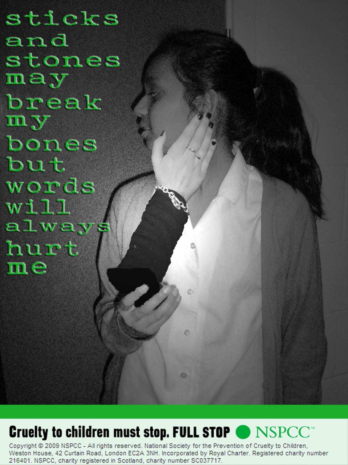
 We are not using this one because she does not look sad or frightened enough.


