

 These were originally going to be the final posters. We then decided that the slogan was not spaced out enough and did not look very professional. Therefore we changed the spacing of the slogan.
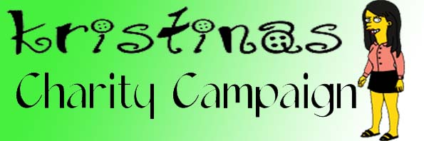 These were originally going to be the final posters. We then decided that the slogan was not spaced out enough and did not look very professional. Therefore we changed the spacing of the slogan.
 We chose this typography because it looks like a child's writing, we have decided not to use it as the 'o's are too big.
 We choose this typography because it looked like someone has drawn it. We have decided not to use it because it looks too old.
 It looks like a little child has wrote it, and scribbled back over, emphasising the words. But once you change the colour of the words, it does not give the same effect.
 We are not using this image because she is smiling.
 We are not using this shot because we do not like the angle.
 We are not using this shot because she is smiling.
 We are not using this shot because we decided it was the wrong angle.
 We are not using this shot because the phone is too far away from her.
 This is the final shot we are using on the third poster because the phone is not too far away from her and she looks frightened.
 This shot is not being used as he looks to far away from the computer screen.
 We are not using this image as he does not look very scared.
 We are not using this shot because he has not got his hand on the mouse.
 This is the final shot we are using as his hand is on the mouse, he is not too far away from the screen and he looks frightened.
 We are not using this image because she looks too happy.
 We are not using this one because she does not look sad or frightened enough.
 We are not using this image because she looks like she is smiling.
 This shot is not being used as again she looks like she is smiling and someone is sitting in the background.
 We are not using this shot because someone is in the background.
 We are not using this one because she does not look scared.
 This is the image we are using, because she looks scared and there is nobody in the background.